Hello Fellow Codenewbies 👋
Flexbox is known as one dimension. It means that it deals with one dimension layout at a time, the column or the row.
When we talk about a column or a row in flexbox, we are talking about the main axis or the cross axis.
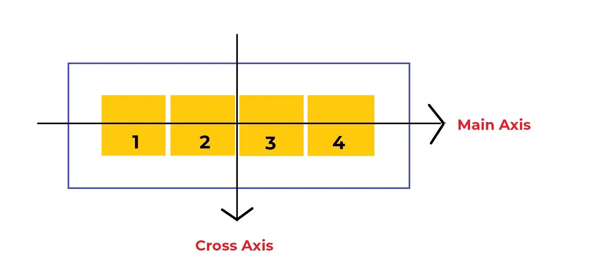
Making responsive layout with flex-direction
Before we talk about the values of flex-direction, you can check the playground that I provide below.
The screenshots that I attached in each value’s explanation are based on this playground.
The values in flex-direction
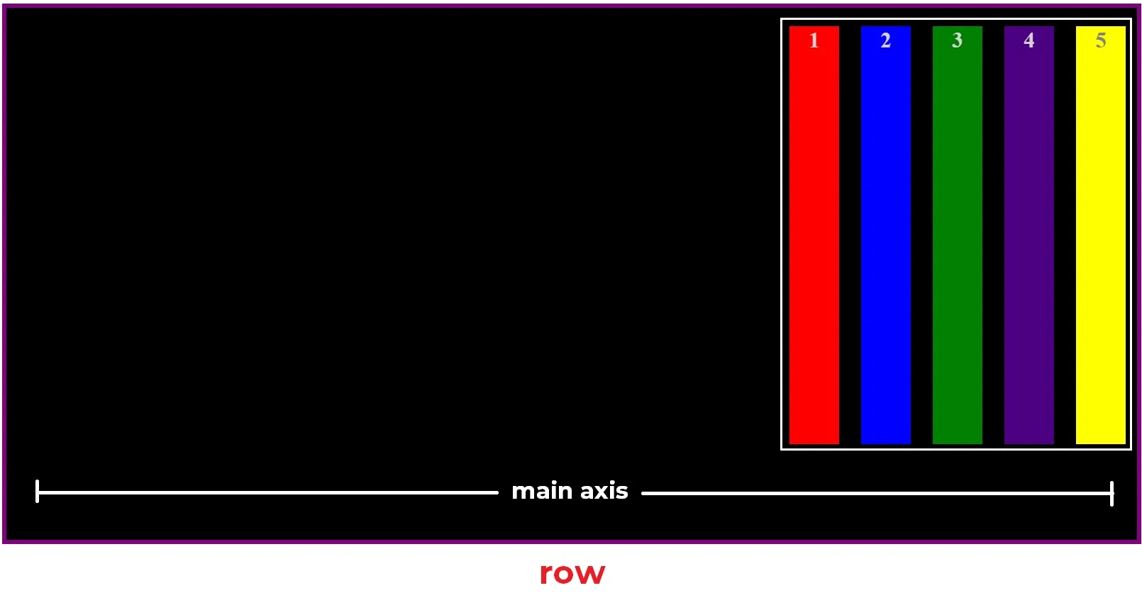
Row
⭐ This the default value.
This value makes the flex container becoming a row and the flex items become columns.
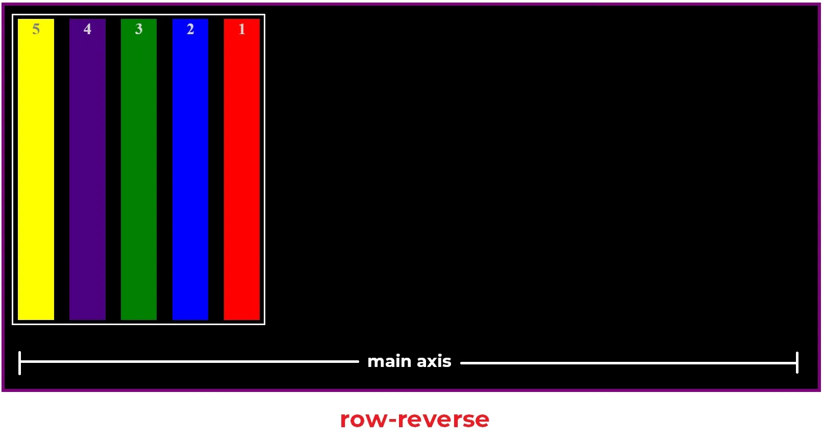
Row-reverse
Same as row, but it reverses the order of the flex items.
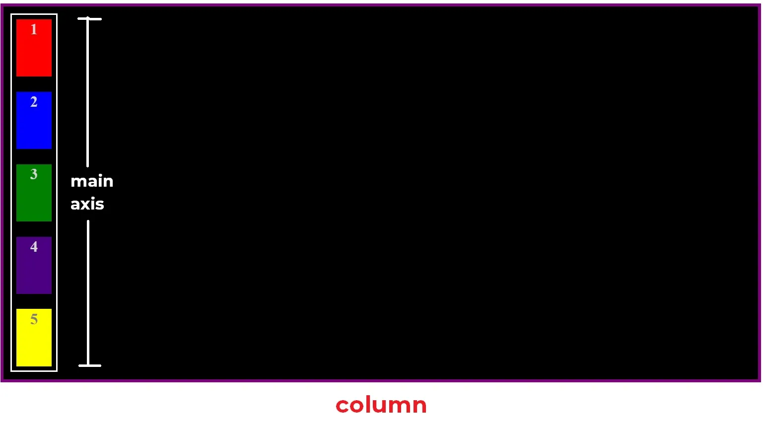
Column
This value makes flex container becomes column and flex items become rows.
In a glimpse, it looks like the default layout when we don’t apply display: flex. But under the hood, this value switches the main axis.
And because there is a change on the main axis, there are changes as well in the behavior of:
-
justify-contentThis now will work vertically
-
align-itemsThis now will work horizontally
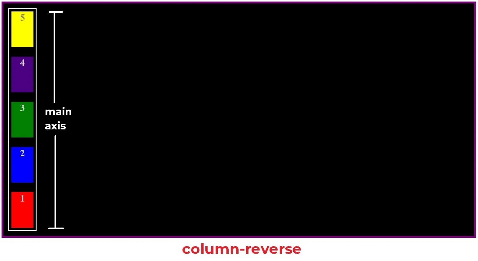
Column-reverse
Same as column, but it reverses the order of the flex items.
We usually use media queries when we want to apply flex-direction.
Conclusion
flex-directionis changing the main axis around.- The values of
flex-direction:row(default)row-reversecolumncolumn-reverse