


Hello Fellow Codenewbies 👋
You probably use px or em to set up the size of your image in CSS.
Well, I did.
But there is a good practice that I learned recently on how to set up the size of images, particularly the width.
Percentage is better to be used when we want to set the width of an image.
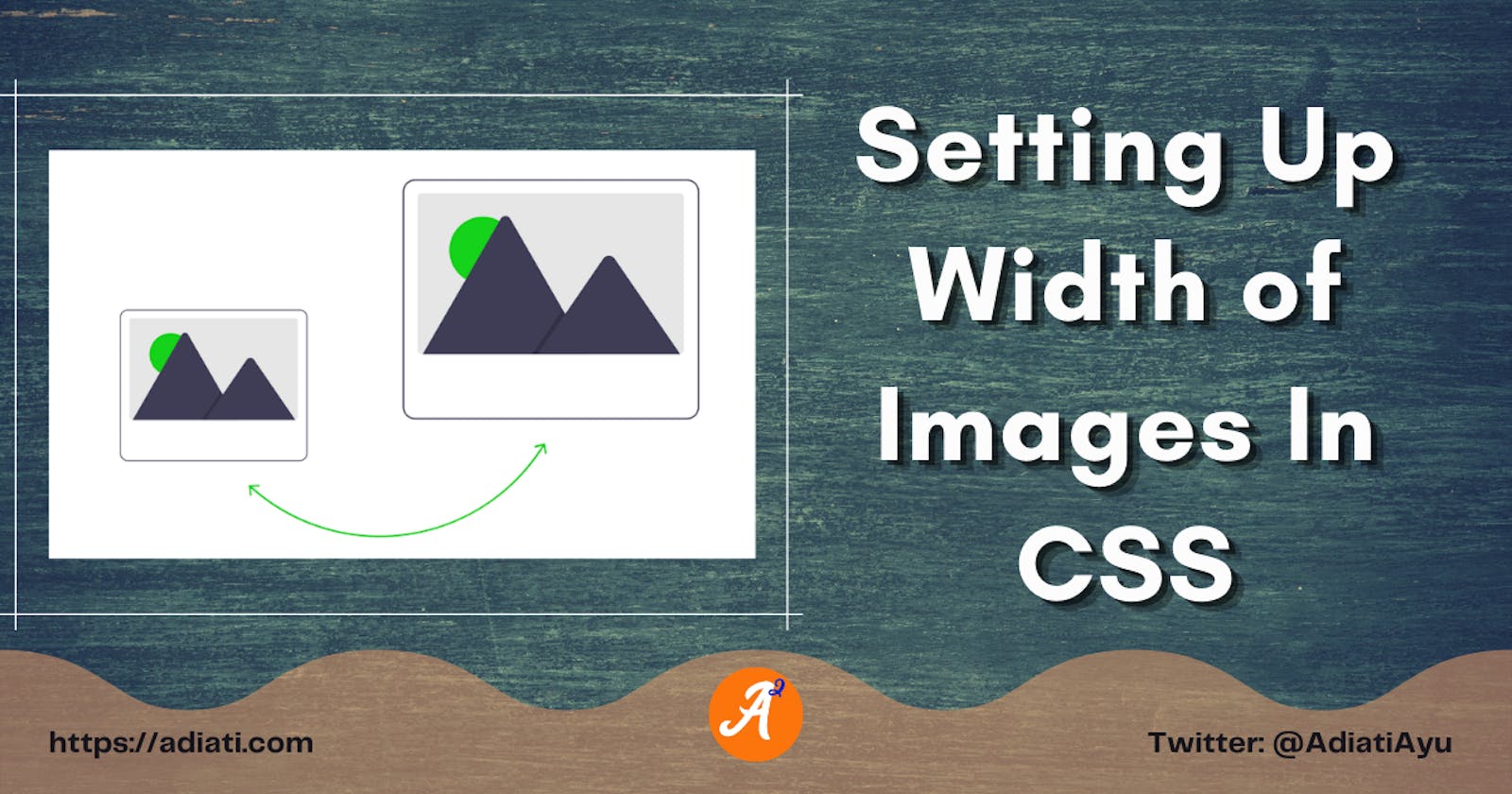
Let's take a look at this example.
In this example, we set the width of the image to 100%.
Oops.
Are you seeing a blurred image?
Maybe now you think that this image has bad quality?
The image has a relatively small resolution of 800 x 532 pixels.
What will happen if we expand the size of an image to be more than its own size?
Precisely! The quality will be reduced and we start to see pixels.
So it is not the image that has bad quality, but percentage as one of the relative CSS units makes the width of the image relative to its parent.
Setting up the width to 100% to the image means that the width of the image is as big as the width of the parent, which in this example, we've set the parent's width to 200%.
What should we do now?
We use the max-width instead of width and set it to 100%.
img {
  max-width: 100%;
}
We cannot change the quality of an image.
But when we work with images, especially images with relatively small-resolution, we better keep their original resolution to maintain their quality.
By setting max-width to 100% to an image, we are setting the maximum width to 100% of its own size.
So, the image would never get bigger than it is supposed to be even though the width of its parent gets bigger.
Conclusion
- When we work with images, it's a good practice to use
max-widthinstead ofwidthto maintain the quality of the image.