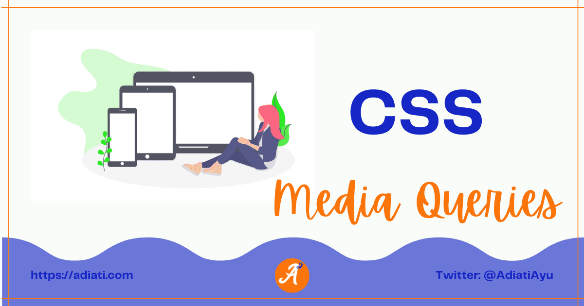
CSS: Media Queries
A
Ayu is a tech blogger, open source contributor & maintainer, and tech community enthusiast based in the Netherlands. She loves photography and iced coffee!
Search for a command to run...
Ayu is a tech blogger, open source contributor & maintainer, and tech community enthusiast based in the Netherlands. She loves photography and iced coffee!
No comments yet. Be the first to comment.
This series is my log of what I learned about responsiveness in CSS
Hello Fellow Codenewbies 👋 Flexbox is known as one dimension. It means that it deals with one dimension layout at a time, the column or the row. When we talk about a column or a row in flexbox, we are talking about the main axis or the cross axis. ...
Hi friends 👋, I've been writing tech blog posts for a few years now. If you don't know me yet, English is my second language. My mother tongue is Indonesian, and I'm also surrounded by Dutch every da
I frequently receive messages from enthusiastic contributors who have completed 2 or 3 high-quality pull requests (PRs) in just 1 month. They’re proactive, their work is top-tier, and they’ve handled
A few months ago, I shared a story about building an automated open source portfolio using just my smartphone and an AI assistant while on vacation. My main goal was to stop the "spreadsheet struggle"
Recently, I read Bekah Hawrot Weigel’s blog post, "When 'Local' Went Global: The Pandemic Era of International Communities." As someone active in many online communities, I found it a bit sad, but I agree with her points and think they apply to open ...
Hacktoberfest is almost over. How has your contribution journey been so far? Are you confident about contributing to open source projects, or are you still struggling to find your way? If you're new to open source and still feel overwhelmed, that's c...
Hello Fellow Codenewbies 👋
So let's say we have finished styling our app.
But on a certain size of the page view, we want to apply a different style to our app.
This is the time where media queries come into play.
Media queries are used for responsiveness purposes.
It targets some specific types and conditions to apply a different style.
The syntax:
@media () {...}
We put it this way:
@media media-type and (media-conditions) {...}
Different types of media that we target with media queries.
@media screen (...) {...}
print
It targets a document for printing purpose.
This type allows users to print out a page in a format that we have set the rules on.
@media print {...}
speech
It targets the devices that read the content audibly, such as a screenreader.
@media speech {...}
all
It targets all media types above.
⭐ This is what is commonly used.
@media all and (...) {...}
When we don't assign any type, then by default it will fall into all.
@media (...) {...}
Specific conditions that we target with media queries.
Width
@media (min-width: ...) {...}
or
@media (max-width: ...) {...}
or
@media (min-width: ...) and (max-width: ...) {...}
max-width
Applying specific style until the stated value.
When we are designing our app for desktop-first and working our way down, then we better start with max-width.
📝 Applying min-width and max-width:
@media (min-width: 400px) and (max-width: 800px) {
 .container {
    display: flex;
 }
}
📖 From width of 400px until 800px apply display: flex to the element with class container.
Orientation
@media (orientation: portrait) {...}
or
@media (orientation: landscape) {...}
Applying both media-types and conditions are optional.
We don't need to apply both, but we do have to apply at least one of them.
To combine media-type with media-condition we have to use and.
@media screen and (min-width: 640px) and (max-width: 1000px) {...}
Order is important.
Sticking to the basic CSS rule, whatever comes next wins.
So we need to apply media queries after the initial style to override it.
A good way to do this is to put media queries at the bottom, at the end of all initial style codes.
We have to state the element that we want to modify inside the media queries block scope.
body {
   margin: 0;
   padding: 0;
}

h1 {
   color: green;
}

.container {
   margin: 0 auto;
}

.bigger-paragraph {
  font-size: 2rem;
}

@media (min-width: 500px) and (orientation: landscape) {
  h1 {
     color: blue;
  }

  .bigger-paragraph {
    font-size: 4rem;
  }
}
I provide the Codepen below to play with.