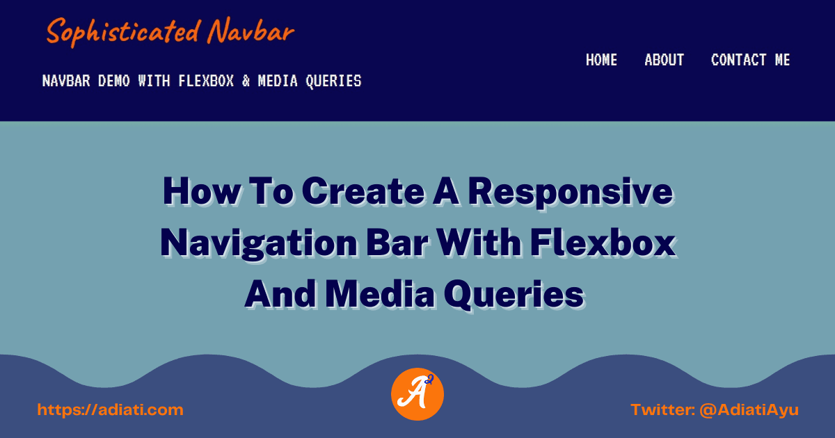
How To Create A Responsive Navigation Bar With Flexbox And Media Queries
A
Ayu is a tech blogger, open source contributor & maintainer, and tech community enthusiast based in the Netherlands. She loves photography and iced coffee!
Search for a command to run...
Ayu is a tech blogger, open source contributor & maintainer, and tech community enthusiast based in the Netherlands. She loves photography and iced coffee!
truly helpful Ayu & led me 2signing-up with hashnode as well as following u. been stuck 4 2months trying 2make a responsive navigation bar with 2 logos & a paragraph tag in between.. wonder if u can help. i'm jst a newbie, kindly guide how best i can share the code if u r interested, regards
Thank you, Devalla! 😊 I'm glad if it helps 😃
This series is my log of what I learned about responsiveness in CSS
Hello Fellow Codenewbies 👋, There are many factors to consider when we think about responsiveness in CSS. One of them is CSS Units. There are two types of units: Absolute Relative - to the size of font (em, rem, etc.) and viewport (vh, vw, etc.) ...
Hi friends 👋, I've been writing tech blog posts for a few years now. If you don't know me yet, English is my second language. My mother tongue is Indonesian, and I'm also surrounded by Dutch every da

I frequently receive messages from enthusiastic contributors who have completed 2 or 3 high-quality pull requests (PRs) in just 1 month. They’re proactive, their work is top-tier, and they’ve handled
A few months ago, I shared a story about building an automated open source portfolio using just my smartphone and an AI assistant while on vacation. My main goal was to stop the "spreadsheet struggle"

Recently, I read Bekah Hawrot Weigel’s blog post, "When 'Local' Went Global: The Pandemic Era of International Communities." As someone active in many online communities, I found it a bit sad, but I agree with her points and think they apply to open ...

Hacktoberfest is almost over. How has your contribution journey been so far? Are you confident about contributing to open source projects, or are you still struggling to find your way? If you're new to open source and still feel overwhelmed, that's c...

Hello Fellow Codenewbies 👋
We've learned about Flexbox, justify-content, align-items, flex-direction and media queries.
In this post, we will create a simple navbar with what we've learned so far.
We will work on the bigger screen and working our way down to the smaller screen sizes.
 Bigger screen (laptop, etc.)
 Smaller screen (mobile, etc.)
In our navbar, we will have a title (or a logo if you prefer) and a description.
We will also have an unordered list of the links to a few pages.
📝Side note:
Some developers use <div> as the container for the links, but it is still a common practice to use <ul> for semantic and accessibility purposes because links in navbar are an unordered list.
Following the semantic rule, let's create a <header> since our navbar is the header of the page.
Inside our <header>, we will have an <h1> (or <img> for a logo) and a <p> with a class of "subtitle" for the description of the site.
We will also want to have a <nav> with <ul> and some <li>s with <a> for the links to our pages.
As we don't need to refer the link to anywhere else, for now, we put # in the href.
<header>
    <h1>Sophisticated Navbar</h1>
    <p class="subtitle">Navbar Demo With Flexbox & Media Queries</p>
    <nav>
      <ul>
        <li><a href="#">Home</a></li>
        <li><a href="#">About</a></li>
        <li><a href="#">Contact Me</a></li>
      </ul>
    </nav>
</header>

Great!
It doesn't look good so far, but we will style it soon 😊
First of all, for the sake of the styling, we will wrap the <header> and everything inside it in a <div> and give class of container and container-nav.
📝 Side note
It is a common practice to create multiple classes to an element when we intend to reuse it for the same styling in other places.
For example, when we want to apply the more generic style that we set in .container to a <header> and a <section>, and/or any other elements.
But in this tutorial, we will not reuse it. I just want to give you a sense of what is the common practice in the real world.
We want to make the <h1> and the <p> be side by side with the <nav>.
Therefore, we want to wrap them in a <div> and give it class of "titles".
We are grouping them for styling purposes later on.
<header>
  <div class="container container-nav">
    <div class="titles">
      <h1>Sophisticated Navbar</h1>
      <p class="subtitle">Navbar Demo With Flexbox & Media Queries</p>
    </div>
    <nav>
      <ul>
        <li><a href="#">Home</a></li>
        <li><a href="#">About</a></li>
        <li><a href="#">Contact Me</a></li>
      </ul>
    </nav>
  </div>
</header>
I'm using Caveat and VT323 fonts from Google Fonts. Feel free to use any type of fonts of your choice.
<body>What we are doing here:
margin to 0..subtitle and <nav>.
<body>. I am using the VT323 as the default font.body {
background-color: #719fb0;
font-family: "VT323", monospace;
margin: 0;
}

What we are doing here:
<h1> to overwrite the default font. margin: 0; to <h1> to get rid of the default margin that comes with it.color and font-size for the <h1>, .subtitle and nav a.text-transform: uppercase; to the .subtitle and nav a.h1 {
font-family: "Caveat", cursive;
font-size: 2.5rem;
color: #fd5f00;
margin: 0;
}
.subtitle,
nav a {
font-size: 1.5rem;
color: #f9f8eb;
text-transform: uppercase;
}

.containerWhat we are going to do here:
width: 90%; to give some space on the left and right sides.max-width: 900px;.
max-width to an element will prevent it to get bigger than the value stated when we expand the window or view the page on a bigger screen.margin: 0 auto; to center the .container..container {
width: 90%;
max-width: 900px;
margin: 0 auto;
}

📝Author's note:
I'm giving a border to some elements to give a clearer view of how things working and look like.
.container-navFor bigger screen sizes, we would like to have the .titles be in line with the <nav> and we will do this with Flexbox in .container-nav.
This way, we can reuse the .container - as the more generic style - when we need it in the future.
What we are going to do here:
display: flex;.
<nav> to the top and in line with the .titles.justify-content: space-between; to give space between the .titles and the <nav>.
<h1> and the .subtitle in a <div>. Now we can apply the space-between to give space and split our .titles and <nav> as groups.align-items: center to center both .titles and <nav> vertically..container-nav {
display: flex;
justify-content: space-between;
align-items: center;
}

<header>What we are going to do here:
Apply box-shadow, just for some aesthetic purpose.
header {
background-color: #05004e;
padding: 0.8em 0;
box-shadow: 2px 2px 10px #f1f6f9;
}

nav ulNow we will style all <ul> inside our <nav>.
What we are going to do here:
list-style to none, to get rid of the bullets.Apply display: flex; to make the flex items inline.

Apply padding: 0; to get rid of the padding that comes as default.
nav ul {
list-style: none;
padding: 0;
display: flex;
}

nav liWhat we are going to do here:
Apply margin-left: 2em; to give space between the <li>s.
nav li {
margin-left: 2em;
}
Now, if we shrink the size, we can see that all <li> have space and the first <li> is not touching the .titles.

nav aWhat we are going to do here:
text-decoration to none, to get rid of the link's underline.We will also:
nav a {
  text-decoration: none;
}

nav a:hover,
nav a:focus {
  color: #fd5f00;
}

This all looks good so far.
Next, we will apply media queries to make our navbar responsive 😊
We will set the max-width of 640px for all type of media.
This means that all styles in the media queries will be applied from smaller sizes until the maximum width of 640px. Above that width, the initial style will be applied.
What we are going to do in the media queries:
Center the texts inside .container, so when we shrink the page, we will have all texts centered.

Apply flex-direction: column; to the .container-nav.
This will change the direction of the main axis, stack our .titles and <nav> as a column.

Apply flex-direction: column; to the nav ul.
 Pay attention to the
 <li>s. They are all go a little bit to the right side.
This is because previously we set margin-left of 2em to our nav li.
We will fix this with the next step.
Set 0.8em margin-top and -bottom to the nav li and 0 margin-left and -right to reset the margin that we set before.
@media (max-width: 640px) {
  .container {
    text-align: center;
  }

  .container-nav {
    flex-direction: column;
  }

  nav ul {
    flex-direction: column;
  }

  nav li {
    margin: 0.8em 0;
  }
}

And that's it!
Our simple navbar with Flexbox and media queries.
I provide here the Codepen playground for you to play around.
I hope you enjoy the article and can learn something from it 😊